Saturday, November 8, 2008
LED Experiment
 Most everyone these days has a CFL bulb somewhere in there house. Usually they are in a closet or in a utility space since the light qualities were not as warm and appealing as incandescent bulbs. Today's CFLs are getting closer and closer to the qualities of incandescents, however they do have some drawbacks such as a delayed full light time and they also carry a small amount of mercury vapor which requires them to be disposed of carefully. LED bulbs are starting to show up in the marketplace as incandescent bulb replacements. Like CFLs they provide much longer life while using a fraction of the energy. Also like CFLs however, LEDs currently do not give as warm a light quality as incandescents. The benefits of LED bulbs however are 50,000 hours of life per bulb and instant on brightness. They are currently only sold online or a specialty stores as the technology hasn't gone mainstream enough to be sold at the larger home improvement stores. As I described in a previous post, almost all of my incandescent fixtures in my condo are now utilizing some form of a CFL bulb. My bathroom is the only place that fixtures without CFLs. I had been using Par 20 halogens which last longer than incandescents, but aren't as efficient as CFLs. I decided that I would tr
 y LED bulbs in the bathroom since the Par 20 bulb has had LED equivalents for a while now. The local specialty supply store, about 25 minutes away, carries these LED bulbs at about $18 a pop. They claim to have a warm white light color, which is nice considering most available LEDs give a off a cool blue white light. They claimed the output of the LED was similar to a 45 watt bulb, so considering the halogens I was using were 50 watt, I figured it would be close enough. Well the result was not exactly overwhelming, especially since one of the LED bulbs didn't even work. The light quality is still a cooler white than the halogens and the output is considerably less. Unfortunately I have to return the one bulb before I can get the full effect, which wont be for another week since specialty stores have specialty hours. The light quality is not for everyone, but I can live with it. Hopefully it results in some form of savings, but if not at least I feel like I have taken one more step in an eco-friendly direction.
Monday, November 3, 2008
Way-finding Art
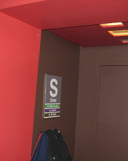 One of the keys to modern design is keeping things simple. With artwork this usually means a bold color expression or single graphic element. Signage is a perfect example of simple modern art. A stop sign for example is an everyday object that when taken off the street post and placed within a home on a wall creates a dynamic feel to a space. We have all had the desire to steal a sign at one point or another, whether it had a particularly interesting color or phrase. In Chicago, no signs are more recognizable than the public transportation signs that designate the elevated train stops. Because the "el" is such an integral part of most Chicagoans' lives, a station sign can tell a lot about your life, like where you live or work, or where you go out for drinks or go see your favorite sports team play. Well luckily, to avoid the guilt of plucking one of these signs while no one was looking, I was able to find them for sale on the web, legally purchased from the CTA. For a reasonable price you can get a very cool, authentic piece of the city, and keep your peace of mind. I gave mine a custom frame and hung it by the door, as an expression of where I go everyday to get to work. Another piece of art that I have hanging by my door is a custom map that I designed. Neighborhood maps are another recognizable way-finding tool widely used throughout the city. Everyone who lives in Chicago claims to know all of the neighborhoods that comprise the city, but I'd bet they don't know half. These maps are always a good
 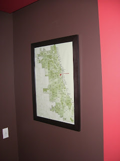 conversation piece as people try to locate their area and the area of their favorite hot spots. These maps, however are typically very traditional in style and I was never able to find any simple versions out there that would go with my place. So luckily I came across an editable pdf version of a Chicago neighborhoods map that I could manipulate in Photoshop. I simplified the graphics, gave it a halftone pattern in the colors of my walls, and gave it a graphic punch with a little bit of humor by adding a "You Are Here" arrrow.
Monday, October 27, 2008
Getting a Better Idea
Computer modeling software is becoming more and more prevalent in today's design world. Rendering software ranges from very complex and sophisticated to quick and sketchy. They all serve their purpose in helping the client or designer get a better idea of a concept. Unfortunately I don't often get the opportunity at work to use these programs as most of our work is done in 2-dimensional AutoCAD. Having been exposed to 3-dimensional rendering software in school has helped me be able to learn newer such programs on my own. I have been able to use these skills on several side projects dealing with both architecture and interior design. I recently learned a new photo-realistic rendering program that is relatively simple, but creates some pretty sophisticated results. I modeled my bathroom for practice and figured it would be a good way to represent the design since it is rather hard to photograph. I hope to gain more practice with this software in the near future on some upcoming side work. This will also give me a better idea for future ideas I have for the remaining inches left untouched in my condo. Check out the bathroom rendering below:

The program used was actually SketchUp, but with a free rendering plug-in called IDX Renditioner.

The program used was actually SketchUp, but with a free rendering plug-in called IDX Renditioner.
Friday, October 24, 2008
Want to Blog About it?
Way back in my first blog entry I wrote about coming from a heavily design-oriented family. My mother, who has assisted in the development of my condo in many ways, is a licensed interior designer working in the Chicago-land area. She has taken an interest in my blog and the whole blog scene in general. After reading the stories about my experiences in the development of my place, she thought it would be a good idea to start her own blog on her design experiences spanning over two decades. I have to say that I was pretty impressed that she was able to get her blog rolling all on her own, since she felt that it may be well over her head. It is still a new blog and I am helping her to get it set up, but be sure to check back with it in the near future:
http://interiorgratification.blogspot.com
http://interiorgratification.blogspot.com
Wednesday, October 22, 2008
The Green Scene
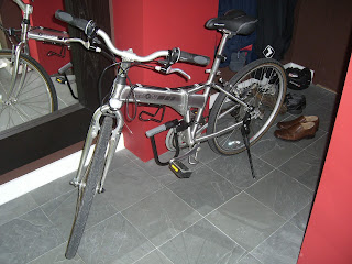
 Chicago is quickly becoming one of the "green"-est cities in the country and the "eco" buzz words are everywhere to be seen and heard. I have always been interested in green design, but living in a tiny condo doesn't leave much room sustainable building exploration. I have been doing my part however, installing a variety of CFL lights in the various incandescent light fixtures I have throughout my unit. Luckily Ikea sells CFL alternatives for almost all of their standard incandescent fixtures. While the light qualities of the small CFLs aren't that great, it doesn't take much to light up 621 square feet. I also purchase and use "Green" cleaning supplies purchased from green building supply stores, helping out local business in the process even though stores like Target also have environmentally safe cleaning supplies. I reuse all of my plastic bags and now have a reusable shopping bag for when I go to the convenient store. Our building recycles plastics, glass, and paper, which helps keep my overall waste down. I also ride a bicycle (another great Craigslist find) and take public transportation as much as I can. The bike is awesome because it folds in half to easily store behind my desk at work, and can easily be tucked away in my hall closet. Too bad the fall weather is now here. All of these small green lifestyle decisions are becoming more like second nature to most Chicagoans, and that is a good sign. I do, however, get to work on larger green building designs at my office
 . I am a LEED Accredited Professional and am currently working on a Chicago Green Homes residence. I have also been able to have a more hands-on approach to sustainable design and green building techniques helping out my friend on his house and getting involved in the Chicago Conservation Corps.
 Monday, October 20, 2008
No More Sunsets
 The beauty of a corner unit, like mine, is the ability to get light from multiple angles and in most cases have two unique views. In a city like Chicago each direction has a distinct vista. To the east is the lake, to the west is the horizon of the surrounding suburbs, to the north is the famous skyline of historic buildings and to the south is the urban sprawl of the city. My condo has west and north views, or I should say had a west view. When I moved in over a year and a half ago, the property to my west was nothing more than a vacant parking lot. Since then an entire condo building has gone up stopping just one floor higher than my unit. The new neighboring building is as close as it can be to mine considering there is a public transportation train line below separating them. So not only do my western windows look out unto the new building next door, t
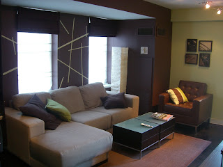 hey look directly at a not so attractive parking garage. I typically keep my blinds down most of the time anyway, but I didn't want to be looking at parked cars during the times I occasionally let natural light into my place. I thought about making removable screens that I could place within each window space, similar to a shoji screen. However on one of my trips to Target, I noticed they had sheer curtains on sale. They had just enough left in the right size for my western windows, so I figured I would give them a try. They ended up fitting perfectly. They may not be the final solution, but they do the job. Sometimes functionality trumps aesthetics. At least I still have my northern view.....for now.

Sunday, October 19, 2008
Wall Hanging Project
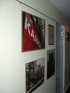
 Continuing from my last post, my entrance hallway has become a showplace for art. There is very little usable space other than vertical wall space in this area so it helps place an emphasis on the wall treatment. That being said, I wanted to create something cool that was on the fairly large blank wall in the hallway next to the bathroom. I had traveled throughout Europe a few years back during a summer exchange program as part of my Master of Architecture program at Tulane University. I had a ton of pictures I had taken throughout my 3 month stay, and wanted a way to showcase a few in a unique way. I liked the idea of a classic picture rail system, but I didn't want the bulk of the rail molding as well as the bulk of the picture frames themselves. I had decided that I would create frame-less picture holders using a hard backer board with a Plexiglas front. I originally wanted to use
  steel stand-offs to hold the plexi and boards together, but couldn't afford the cost if I were to do multiple frames. I secured the pieces together with washers and screws instead, still keeping the overall look simple and almost industrial. I then strung picture wire from the top two screw assemblies of each picture up to a 3/8" diameter rod that I had attached to the wall with conduit secures. The overall look is very clean and minimal. I had gotten the images enlarged through Snapfish online to the various pre-cut sizes of the Plexiglas and boards I had purchased. This was all accomplished for under $75 and the only tool I needed was a drill since I purchased pre-cut sizes of Plexiglas and found the corresponding sizes in hard board at the local art supply store.
Saturday, October 18, 2008
Semi-Original Art
 So one of the many quirks of my condo's layout is the front entry. I have a corner unit which enters off the end of a hallway in between two other units. Because of the relationship of the unit space next to mine, my entry is perpendicular to the main portion of my condo via a small hallway. Since you enter my unit looking at a wall, the original space designer must have figured a niche would serve as a focal point upon entry. The niche is actually a nice element, and almost too nice for a 621 square foot apartment, seeing that if this size place is all I could afford I probably couldn't afford a nice art piece to display. So while the concept was nice, it was left empty for about 7 months after I moved in. For Christmas last year my mother surprised me with an art piece that was not only sculptural, but proportionately fit the size of the niche. She also had my career in mind for it was a triptych of iconic New York skyscrapers made out of metal over a black base. It was a very cool piece on its own, but I had some rese
 rvations about the black since hardly anything in my place was black. She had gotten it from a catalogue and told me she would take it back if I didn't like it. I did like it though, at least in concept, the execution however seemed to be lacking something. I had thought about painting the base or adding some graffiti just to shake it up, but then a friend at work and I brainstormed on an idea. I had thought about texturing the base to try to give it a worn sepia tone and he told me about a staining decoupage technique he used back in art school for some of his work. I liked the idea, but didn't just want any old paper. So he also suggested I look at New York times online for some old articles. I was able to go to their archives online and for a small fee I was able to gather a good amount of 1930's articles about the skyscraper boom. I printed the articles on my printer at home, some a couple times at various scales, and tore them
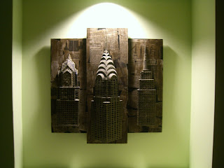 up in to different sized scraps for the decoupage. I made a mixture of water, glue and a little dark water-based stain. After getting the color just right, I started, in no particular order, laying down the pieces of the newspaper articles I had printed. I did try for a good mix of headlines, pictures, and base stories so there was some logic used in the layout. After a few coats of the stained decoupage applied with a foam brush I let the base dry. I reattached the metal skyscraper elements and the result was amazing. Not only did I get color and texture, but content as well. It is definitely a great conversation starter as soon as anyone walks into my place.
Friday, October 17, 2008
Gaining Space...Visually
 When you live in 621 square feet, the walls seem to move in rather quick. And when you are continuously adding elements to a space, a little visual relief is always good. Mirrors are a great way to open a tiny space up and add visual interest to a wall. As far as I am concerned, you can never have too many, but perhaps I am a little narcissistic. From my last post you can see I had added some mirrors along the tv wall in the living space. The mirrors were from Ikea, and at $3 a pop, I bought a bunch and played around with a few configurations. I decided on a strip look at first and used 3M adhesive squares to hold them to the wall. Let me te
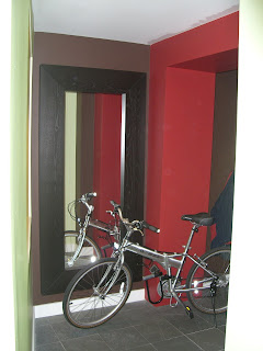
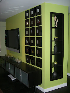 ll you that these strips work well, a little too well because as soon as I put the first one on, I knew it wouldn't come off easily. After the first one went up, I just continued stacking them until I ran out. It wasn't a bad look, but you could immediately see that each mirror wasn't exactly square and so some minor gaps stuck out more than I would have liked. My mother, having used these mirrors before, pointed out that they look better with a little space in between each mirror. Unfortunately it was a little too late, those suckers were on there. I knew taking them down would tear up the drywall, so I lived with it, that is until she came back to visit and told me I had to rearrange them. So I took them down, and as expected took a lot of the wall with. I had gotten pretty good at using the drywall compound from previous projects, so after a fun night of patching up the wall and a quick coat of paint, I had a new surface to work with. I purchased a few more of the Ikea mirrors and rearranged them with gaps in between, and sure enough my mom was right, I owe her for that one. Like I said, you can never have to many mirrors. On my many trips to Ikea, I would always be on the verge of buying their giant Malm mirror, but knew it would never fit in my Jetta or my budget. On one of my previous trips to get t
 he bookcase I used for my built-in, I had noticed they reduced the price of the mirror. Needless to say I was quickly able to find some things around the place that I could dump on Craigslist. I then borrowed my mom's s.u.v. and the mirror I loved was finally mine. There was really only one wall untouched in my place at that point, and for a reason. I knew I would eventually get the mirror for my hallway, so I purposely left the one wall blank until I could afford it and manage to get it home. The mirror wall is at the end of the hallway, so the mirror reflects back into the start of the living space. It definitely makes a huge difference when you walk in, and it's a great place to take that last look at your appearance before you leave....it's that narcissistic thing again.
Thursday, October 16, 2008
My HGTV Moment
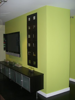 Sitting idle one Saturday morning looking around my place, I noticed the blankness of my hallway area, especially the wall wrapping from the living area into the kitchen. The wall was only about two and half feet wide. It had proven to be an awkward size to hang any artwork because of its proportions. So standing in the hallway staring at this blank space, I noticed the kitchen cabinets weren't directly behind that wall, but rather a couple feet beyond. It never stood out to me before, but since I had the original plan, I knew there wasn't a column hidden in that space. So I cut a small hole in the drywall to peek inside, and sure enough it was an empty cavity left over from the remodeled kitchen design. After seeing almost every makeover show on HGTV, I immediately thought of a built-in shelving opportunity. Instead of building the shelving cabinet from scratch, considering I don't
 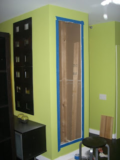 have any real power tools or workspace, I had the idea of using a store bought bookcase. What better store than Ikea, and I already had a piece in mind. The shelving piece from Ikea ran about $70 and had very comparable proportions to the wall I was working with. Once purchased I assembled the shelving unit and measured the overall dimensions. I carefully cut out the shape in the drywall and exposed the stud wall behind. I only had one stud to cut through and used the cut portion to help brace the remaining stud sections to the wall on the other side of the cavity space. This bracing also provided the structural base on which the shelving unit would sit. The Ikea piece that I chose had a nice thick edge to it that I knew would serve as a simple trim, however the piece did not have a backing to it. I reused the drywall that I had cut out of the wall, along with some other pieces I had from previous projects and attached them to the back of the unit with drywall screws.
 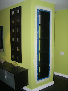 After the opening in the wall was properly braced, I slipped the newly-backed Ikea unit in place and screwed it securely to the bracing. The fit was pretty snug around the drywall opening and I kept the outside edge of the unit about a quarter of an inch from the drywall. This allowed me to work joint compound all around the edges cleanly. After it dried, I gave it a nice coat of paint and for less than $75 and some spare material I had around the condo, I had made a huge improvement to the space. This was by far my favorite project to work on in the place and the most satisfying one as well.
Blogged with the Flock Browser
No comments:
Post a Comment